🛫 Taking Flight: Navigating the Transition to Tailwind CSS ✨
🛤️ Preparing for the Journey: Pre-Migration Steps
Table of contents
Why tailwind 🤔?
"Turbocharge Your Development Speed": Discover how Tailwind CSS can help you style web elements lightning-fast, giving you more time for creativity.
"Design Consistency Made Easy": Learn how Tailwind's consistent class naming can transform your projects into well-organized masterpieces that your team will love.
"Trim the CSS Fat, Speed Up Loading Times": Explore how Tailwind's lean approach to CSS minimizes bloat and keeps your website loading at warp speed.
"Tailor-Made Styling for Your Brand": Dive into the world of Tailwind CSS customization and make your web designs truly unique.
"Join a Stylish Community of Developers": Find out why Tailwind's vibrant community and array of plugins are the secret sauce for supercharging your projects.
"Unlock More Job Opportunities": Discover how adding Tailwind CSS to your skill set can open doors to exciting web development careers.
"Learning Tailwind: Easier Than You Think": Get access to a treasure trove of tutorials and resources that will have you mastering Tailwind in no time.
"Contribute to Open-Source Awesomeness": Explore how Tailwind CSS is taking over the open-source world and how you can be a part of this revolution.
Things to know in frontend framework

1 . flex :
flex basis : use the flex-{basis} to set the sizes of the <div>
  <div class="flex flex-row">
    <div class="basis-1/4">01</div>
    <div class="basis-1/4">02</div>
    <div class="basis-1/2">03</div>
  </div>
f
flex direction
flex
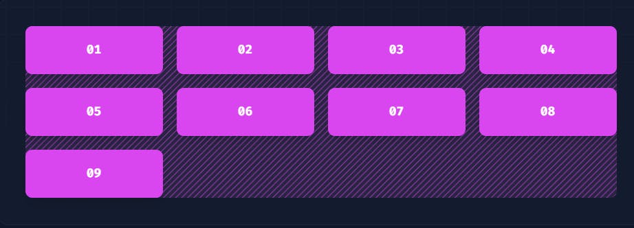
2 . grid :

<div class="grid grid-cols-4 gap-4">
  <div>01</div>
  <!-- ... -->
  <div>09</div>
</div>
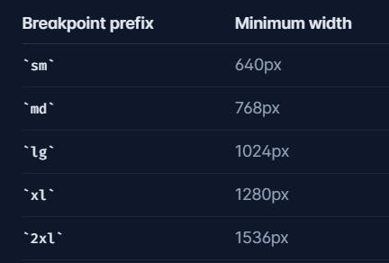
3 . responsiveness
These are the standerds breakpoints of a tailwind

<div class="max-w-md mx-auto bg-white rounded-xl shadow-md overflow-hidden md:max-w-2xl">
  <div class="md:flex">
    <div class="md:shrink-0">
      <img class="h-48 w-full object-cover md:h-full md:w-48" src="/img/building.jpg" alt="Modern building architecture">
    </div>
    <div class="p-8">
      <div class="uppercase tracking-wide text-sm text-indigo-500 font-semibold">Company retreats</div>
      <a href="#" class="block mt-1 text-lg leading-tight font-medium text-black hover:underline">Incredible accommodation for your team</a>
      <p class="mt-2 text-slate-500">Looking to take your team away on a retreat to enjoy awesome food and take in some sunshine? We have a list of places to do just that.</p>
    </div>
  </div>
</div>
4 . background color
<button class="bg-sky-500/100 ..."></button>
<button class="bg-sky-500/75 ..."></button>
<button class="bg-sky-500/50 ..."></button>
5 .text color
<p class="text-sky-400">The quick brown fox...</p>
6 . hover
<button class="bg-sky-500 hover:bg-sky-700 ...">
  Save changes
</button>
Well if you know these 6 things you can design a good to go website in tailwind
But there is no better source other than the official docs
happy building 😊
